
This is the second blog post about accessibility. If you missed the first post, Sein Tun does a great write up on the different acceptance criteria for accessibility, testing your site, and some quick tips. You can check out the blog post here: Web Accessibility: How to Enable Access for Everyone
Accessible content has been an increasingly important feature in various software products. To facilitate these accessibility goals, major web frameworks have been adopting accessibility design patterns into their respective libraries. Popular libraries like Highcharts, Angular, React, and many more include accessibility out of the box and allow for extensible modifications to make any web application accessible.
The most common web accessibility standard is the Web Content Accessibility Guidelines 2.1 (WCAG 2.1) which was created by the World Wide Web Consortium (W3C). The W3C has created a set of guidelines to help standardize content and to enforce better practices while creating accessible web content. There are currently three levels for WCAG 2.1 A, AA, and AAA with AAA being the highest level of compliance.
The WCAG 2.1 standard has four main sections, Perceivable, Operable, Understandable, and Robust. Each of the main sections has multiple subsections that describe the success criteria that need to be met in order to achieve WCAG compliance. In this post, we are going to specifically focus on Section 1.4.3 Contrast (Minimum). Other topics will be explored in subsequent blog posts.
The main reason why there has been a push towards accessible content in recent years is for legal compliance reasons. In 1998, Section 508 was added to the Rehabilitation Act of 1973 which required US federal agencies to provide accessible electronic content to both employees and members of the public. Section 508 was further revised in 2017 to formalize that federal agencies must comply with WCAG 2.0 A/AA. So, if a website has anything to do with the government or it is a government contract, there is a legal obligation to implement an accessible website.
Similar precedence also extends to private companies doing business in the US. A blog post by the Bureau of Internet Accessibility breaks down the need for accessibility for private businesses well. To summarize that post, companies should be WCAG 2.0 in order to prevent possible litigation.
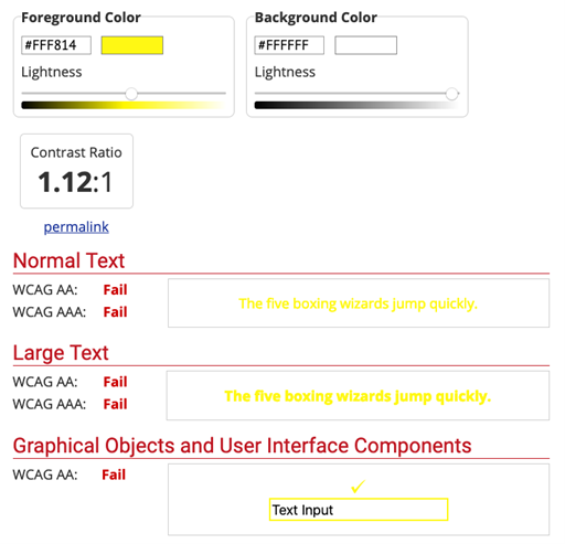
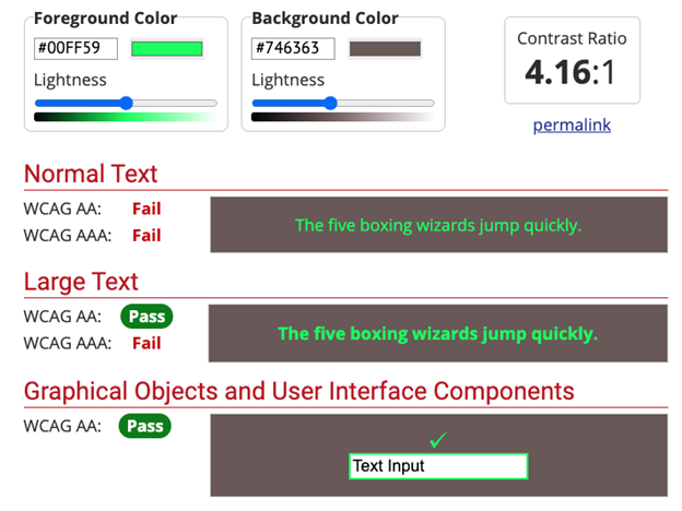
Check out the “Measuring Color Contrast” section to see some examples of poor contrast!
Color contrast is defined as the perceived luminance between two colors. The contrast ratio has a range from 1:1 to 21:1 where 1:1 is white text on a white background and 21:1 is black text on a white background.
There are exceptions for certain elements that do not have to meet contrast requirements. For example, purely decorative text and elements do not have to meet the contrast requirements. This exception also extends to logos and brand names. There are also further distinctions between large text and small text with different ratios for each. You can read more about exceptions on the understanding success criterion page for 1.4.3 Contrast (Minimum).
The WCAG guidelines describe the testing method that should be used to measure the contrast ratio for web elements. The following comes directly from W3 G145 techniques for ensuring that a contrast ratio of 3:1 exists. You can read more about the rationale and the procedure in W3’s article for G145. Read onwards to see how you can test your entire webpage for contrast ratio requirements.
The following is the testing procedure for contrast ratios and is taken directly from the W3 documentation.
After seeing the testing procedure, you’re probably thinking to yourself that it is too much work to test every single element for contrast requirements but au contraire mon ami that is not the case. There are plenty of free and paid solutions for this problem. If you can afford it, third party auditors can scan your web site and measure, log, and highlight various accessible defects and collate that information into a report for your perusal.
Perhaps the more effective solution for finding contrast defects is to use various online tools to automatically calculate the contrast ratio for you. One of the popular tools for one-off testing is the Web AIM Contrast Checker. This site is easy to use and clearly breaks down any defects and explains what each ratio means. The contrast checker is a quick and easy way to test the interactions between two specific colors.
Testing an entire web page is also a breeze with automatic web page scanning utilities. The most popular utility is the axe toolbar. This toolbar scans whatever webpage that you are looking at and reports any accessibility defects that it finds. These defects include contrast ratio as well as other defects like improper HTML structure. A word of caution though, the axe toolbar will return zero false positives because it can only test for things that can be programmatically verified (like contrast ratios). The axe toolbar will not catch semantic accessibility violations (like a non descriptive label).
Contrast ratios are just one aspect of maintaining an accessible website. Creating and maintaining an accessible color theme is imperative both from an end-user perspective as well as a legal perspective. In my opinion, designing for accessibility should be a part of the initial design phase of any software project and not designed for after the fact. It is much simpler to build with accessibility in mind rather than retrofit your project with accessibility tools and themes.
As web developers, we need to treat all users as first class citizens instead of creating an artificial walled garden for a particular subset of users. We need to strive for excellence and try to build applications and products that are inclusive for all. Developing these platforms is a breeze with all the cool accessibility features built into popular libraries and robust testing tools that help detect defects earlier. All in all, creating rich, accessible platforms is becoming the standard for our ever-increasingly interconnected world.

Derrick Chan is a Software Engineer working at Crest Data Systems who graduated from Santa Clara University with a B.S. in Computer Engineering. He has extensive knowledge in various software languages and frameworks like React, JavaScript, Python, C++, and Java. Derrick has a strong passion for building software that matters and has a positive impact. In his free time, he likes playing with different smart home automations, building keyboards, drinking espresso, and just general tinkering with circuits, hardware, and computers.