Introduction to PowerBI Custom Visual Development

Custom PowerBI visual development

PowerBI is a data visualization and data analytics service from Microsoft. You can easily create dashboards and reports with interactive visualizations. PowerBI comes with many built-in visuals, you can also add custom visuals from Microsoft App Source. But if you can’t find any visual that matches your needs, you can create your own custom visual.


Prerequisites

  • TypeScript and d3.js knowledge is required
  • PowerBI Account

Set-up Development Environment

To set up your development environment, all you need to do is download and install Node.JS and follow the instructions below.


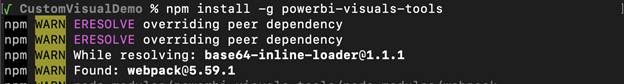
1. Run the “npm install -g powerbi-visuals-tools” command to install the pbiviz library.


Set-up Development Environment step 1


2. Run the “pbiviz –install-cert” command to install the certificate.


 Set-up Development Environment step 2


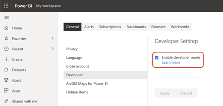
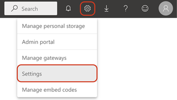
3. Open https://app.powerbi.com/ and login to your account. Then navigate to Settings Icon > Settings.


Set-up Development Environment step 3


4. In the Developer tab, enable developer mode.


Set-up Development Environment step 4

Create and understand the Hello World Visual

To create basic visual, run the following command – 

				
					$ pbiviz new BarChartDemo
				
			
Create and understand the Hello World Visual

It will create a new project, open the folder in any editor. You’ll see the following folder structure – 

Create and understand the Hello World Visual picture 2

The pbiviz file contains metadata about the visual, make sure you fill the necessary information like author name and email address, description and support URL if you want to package it.


The capabilities.json file contains information about data inputs and custom properties of the visual.


In the src folder, settings.ts file is where you create classes for custom visual properties. The visual.ts file contains the main file for the visual.


To view the visual, you need to run the following command – 

				
					$ pbiviz start


Now login to https://app.powerbi.com/ and create a new report. In the visualization panel, there will be a new “Developer visual” icon.

Visualizations

By adding it to the report, it will look like this – 

Create and understand the Hello World Visual picture 4

For the demo, create a table having two columns one containing data of any category and the other containing count of the category.


Select the visual and in the visualization panel, you will see two inputs required for the visual. One is “Category Data” and the second is “Measure Data”. Drag and drop columns from your table.

Create and understand the Hello World Visual picture 5

Try resizing the visual and you will see that the visual updates the count when you make any changes – 

Create and understand the Hello World Visual picture 6

Understanding Data Inputs

The default visual contains two data inputs – (1) Category Data and (2) Measure Data


Open the capabilities.json file, the “dataRoles” array contains the list of inputs and their types. You can learn more about dataRoles and dataViewMappings here.

Understanding Data Inputs Pic 1

Understanding visual.ts

Understanding visualts

The visual.ts file contains a “Visual” class. When the component is created the constructor method is called. And when selection is changed or any property of the visual is changed, the update method is called.


When the update method is called, we need to re-render the visual. The update method has an argument “options” which contains the properties like dataView, viewport, etc. The dataView property will contain the actual data which you can use for visualization. And the viewport property will contain the height and width of the visual.

Create a Bar Chart using d3.js

A security audit is an assessment of package dependencies for security vulnerabilities to help you protect your package’s users by enabling you to find and fix known vulnerabilities in dependencies.The custom visual that you have just created, already has the d3.js library installed. We can use it for creating visualization.


For creating a Bar Chart Visual we will create a new visual. I have created a repo containing all the steps required to create a simple Bar Chart visual.


Clone the repo by running the following command, and open it in any editor. 

				
					$ git clone https://github.com/Yash-Amin/PowerBI-BarChart-Demo.git


Step 1 – Create new visual


Run the following command to checkout to step 1 branch.

				
					$ git checkout 1


This branch contains the default visual code, when you run the “pbiviz new” command.


Step 2 – Remove unnecessary code


The default visual has too much unnecessary code so in this branch I have cleared the things which we don’t need from visual.ts, settings.ts and capabilities.json files.


Run the following command to checkout to step 2 branch.

				
					$ git checkout 2


Step 3 – Parse the data


In step 3, we will create a function to parse the given data and create a list of objects which we can easily use in creating visualizations.


Run the following command to checkout to step 3 branch.

				
					$ git checkout 3


Run your visual in development mode using “pbiviz start” command, and add your visual in the report and add required data.

Step 3 - Parse the data

For this visual, we have used categorical dataView. To understand the structure of the data, click on the “Show Dataview” icon.

Step 3 - Parse the data pic 2

It will show the value of “dataViews” property of the “options” argument of the update function in the visual.ts file.

Step 3 - Parse the data pic 3

We have used categorical dataView, so the “categorical” property will contain the data. The “categories” property has category value and the “values” property contains the measure data.


We need to parse this data and store it in a way which is easier to work with. I have created this interface to store the category and its value.

Step 3 - Parse the data pic 4

I have created this function to parse the data, and return list of datapoints.

Step 3 - Parse the data pic 5

We need to parse the data each time when the visual’s update function is called. The update function prints the parsed data.

Step 3 - Parse the data pic 6

You can open the devtools in your browser and see actual values.

Step 3 - Parse the data pic 7

Step 4 – Show the data using d3.js


In this step, I have used d3.js to show the data in the visual.


Run the following command to checkout to step 4 branch.

				
					$ git checkout 4


I have modified the update function to show the DataPoints using d3.js functions.

Picture21 - Step 4 - Show the data using d3 pic 1

It will show the data like this – 

Picture22 - Step 4 - Show the data using d3 pic 2

Step 5 – Show bar chart


Run the following command to checkout to step 5 branch.

				
					$ git checkout 5


I have modified the update function to show the bar chart. The following code will add a bar (rect element) in the barContainer, and in each bar it will add a title element. When you hover on any bar, it will show a tooltip.

Picture23 - Step 5 - Show bar chart pic 1
Picture24 - Step 5 - Show bar chart pic 2
Next Steps

Now that you know the basics of custom Power BI visual development, you can learn other advanced topics like different types of Data View Mappings, Custom Properties for your visual, adding selection support using Selection Manager, and Showing tooltips. You can refer to the official documentation https://docs.microsoft.com/en-us/power-bi/developer/visuals/ to learn these topics.


cropped-Crest-ICON-png.png
AUTHOR

YASH AMIN

Yash Amin is working as a Software Engineer at Crest Data Systems. Yash has experience in various technologies and frameworks like Python, Flask, Node.js, Flutter, React, Redux and Golang. Apart from this, He enjoys doing bug bounty and participating in CTFs.